
With the growing Total Locked Value (TVL) of DeFi, there are now more and more options for on-chain analytic platforms that provide DeFi data, all with the promise to generate insights for blockchain investment.
However, transforming the raw data into meaningful insights without any tools poses an enormous challenge.
That’s where DeFi dashboards come in.
Most investors and analysts use data to build dashboards showing key indicators. When it comes to broader DeFi data (rather than just cryptocurrency trading, which has its own platforms like Glassnode), there are two types of tools:
- Fixed-form dashboards. E.g.Nansen, Chainbeat, Token Terminal
- Customized dashboards. E.g. Dune Analytics, Footprint
So, how do you pick the right platform for your needs?
Fixed-form dashboards
Fixed-form dashboard platforms provide pre-made dashboards created by professional analysts or the platform. Since you don’t have to create your own or import data, these types of platforms are very convenient for users to get a quick snapshot of data trends. On the other hand, these types of tools lack flexibility.
Nansen is one of the most well-known analytics platforms for DeFi. It’s an easy plug-and-go solution for beginners but lacks the cross-chain capability to let users uncover macro insights.
How to Use Nansen
In Nansen, you can select a single token representing its protocol with “Token God Mode.” However, you cannot get an overview of the entire DEX industry as the analytic logic of the platform is to provide in-depth insights into single tokens on their own, with data like supply, holders, and trades.
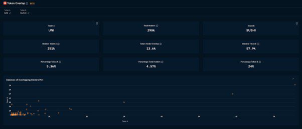
You can have charts showing selected tokens, although you can’t do a cross-chain comparison of multiple tokens. While Nansen provides a dashboard named “Token Overlap” (comparing only two tokens), dimensions to compare are limited. Moreover, cross-chain data of Polygon and BSC is not yet available.
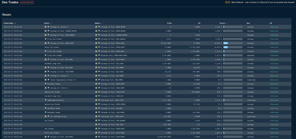
Another useful dashboard is called “Dex Trades,” which provides live updates of on-chain transactions between two tagged addresses through different dexes.
Nansen provides live data, and it has a wide array of dashboards (26 dashboards provided for now). However, its main shortcoming is that you cannot compare different protocols under one category.
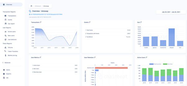
Chainbeat is another fixed dashboard platform and is very similar in functionality to Nansen. However, it has a lighter design.
How to Use Chainbeat:
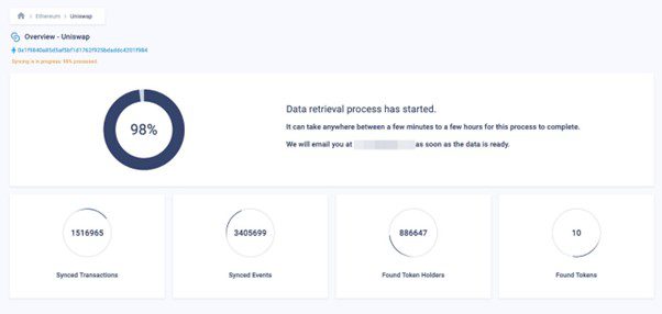
Besides for premade dashboards, you can build your own dashboards for a particular token too. Just submit the address of the token ( and wait about 30 minutes to import the data.
The Chainbeat dashboard comprises one overview and three separate reports of transactions, users, and tokens. The loading times leave much to be desired and the single-token dashboard still cannot satisfy the demand of making a DEX dashboard.
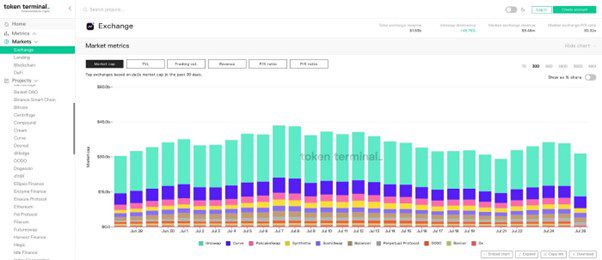
Token Terminal focuses on analysis for DeFi protocols. It has various market options (DeFi, lending, exchange) and is a suitable option for investors.
How to Use Token Terminal:
To see the market cap of the Top 10 DEXs, select the “Markets” section, and click “Exchanges”. This is just one example of useful data with Token Terminal. Other indicators include TVL and Trading Vol. Revenue indicators are also provided by Token Terminal, helping users get a better understanding of each protocol’s growth.
With Token Terminal, you can also compare multiple protocols with any selected indicator. This chart is interactive and easy to work with.
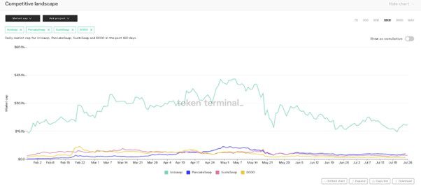
Token Terminal provides an intuitive user experience with a nice set of data indicators. It is better than many other options for building a dashboard with different charts on one page instead of changing indicators every time.
Customized Dashboards
Unlike fixed dashboards, customized dashboards let users pick and choose which indicators to compare. This allows analysts to use their creativity and dig for insights and also lets experienced blockchain pros get extremely granular with their data.
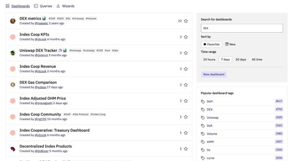
Dune is a do-it-yourself platform that provides on-chain data and tools to build your own dashboard. You can find many finished dashboards created by the Dune community.
How to Use Dune Analytics
Dune encourages users to fork queries in any dashboard to simplify the process of creating a dashboard for a similar topic. Users can reorganize their own dashboards by adding different queries from other dashboards.

To make new queries, users need to write SQL querying the data from the Dune database. A less complicated way is to find a similar query and change the query parameters. For example, you can make a monthly DEX volume query by simply forking the existing query named Weekly DEX Volume, then changing the time period from ‘week’ to ‘month’.

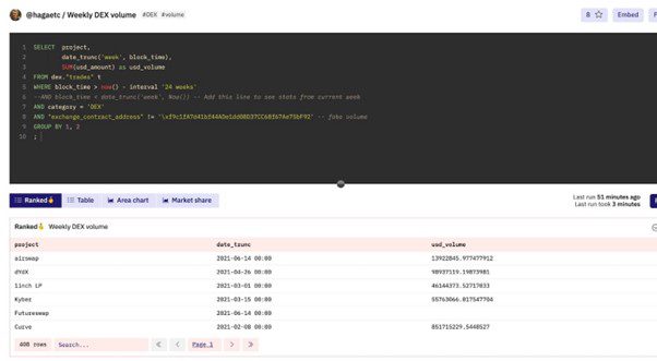
One major shortcoming of Dune Analytics is that forking and writing queries are quite complex for the average user. For those who lack SQL knowledge, they can only fork similar queries with limited modifications. Diving deeper into on-chain data to find your own insights would require technical expertise.
Footprint is an all-in-one analytics tool to uncover and visualize blockchain data. The product is designed to put the user first — whether you’re an analyst, data scientist, developer, student, teacher, executive, or business user. It provides an intuitive user interface for interactive data query with drag-and-drop, like the powerful data querying tool.
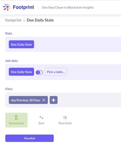
How to Use Footprint
Footprint focuses on cross-chain data, which means you can make cross-chain comparisons of the same project or sector to see the growth trends of different ecosystems.
Footprint provides a similar way to duplicate dashboards you are interested in. You can also easily share your insights on social media either as an image of the entire dashboard or as an embedded HTML of a live dashboard.

Compared to Nansen and Dune, data in Footprint is not updated in real-time, but on a daily basis. However, this does not greatly affect the relevancy of most indicators, such as TVL.
Summary
As the TVL of DeFi grows, so do the options for analytics.
It can seem difficult to navigate the various platforms. However, each platform review has its own strengths and a clearly targeted user group.
- If you just want to see the basic statistic indicators of projects and sectors or categories, Token Terminal is the simplest and most completed with their special indicators of Revenues, P/E ratio, and P/S ratio.
- For analysis of a simple token or platform, Nansen is a nice choice (at least you don’t need to wait).
- For those who know how to write SQL and want to play with the data, Dune provides raw data and a hardcore DIY platform
- For those who would like to explore on-chain data but don’t know or simply don’t want to write codes, Footprint is another easy to get started.


